Work Placement [Week 2 to 5] - Brand Identity Design
Week 2
As a freelance designer I have recevied a request from a hearing aid manufacturer in Singapore for rebraning and identity design. The company is called "My Ear" is producing hearing aid devices and selling their products in Singapore and New Zealand. Their target audience is people with hearing problems - mostly age range of 55+, but they want their logo to be simple and modern.
Color Theme
The color theme I chose for this brand is in a range of orange and yellowish. The reason for choosing such a color swatch is to represent enthusiasm, happines, success and encouragement - especially for old people.

Ideas
The idea for designing a logo for this brand is to make the logo representing the nature of their products which is hearinf aid and making your ear (hearing ability) stronger. To emphsize this concept, the logo should visualize the ear and the funtionality of the brand. So, the symbols of ear and waves should be used in the logo mark.
Sketches
Here are some sketches I have done for the first round of designing.

Week 3
After receving feedback from client for my draf sketches in the last week, I proceed to do digital sketches based on client's comments. The logo needs to be typographic so the word "my ear" should be in the logo together with my ear sign. Below are the first digital sketches:
The client likes the logo with ear sign so they want to see a few more variations of it. Here are more variations for the option that client chose:
And finally, the choosen logo featuring their tagline.
Outcome
By designing logo for client I had a chance to learn that:
- Communication with client is the key as you design a solution for your client and you should know if your design covers their needs
- Your design should be communicating with its consumers/users, so it should be designed based on the brand target audience
Week 4
After desigining the logo (brand ID) I was asked to design a business card (name card) for the client. A business card usually includes giver's name, company name, business identity (logo) and most importantly, the contact information.
The name card needs to be following the brand identity colour theme and art style. As this business is producing and selling earing aid tools and their target market is focused on people with hearing problems and old people, my suggestions for the business card are:
- Colour of the card should be vinrant (orange color of identity) - So (old) people can notice and find it easily when they need it
- Design needs to be clean and cear
- Design elements (radiations / waves) that used for brand identity should be used on card so it conveys the brand's objective (heading aid) to the audience
Another suggestion to the client is also to layout the card vertically so it would be easier to grab for (old) people when handing the name card to them - which client agreed with it.
Sketching
Based on the requirements and information I have started sketching two designs for the client's business card. Below are my digital sketches and designs:
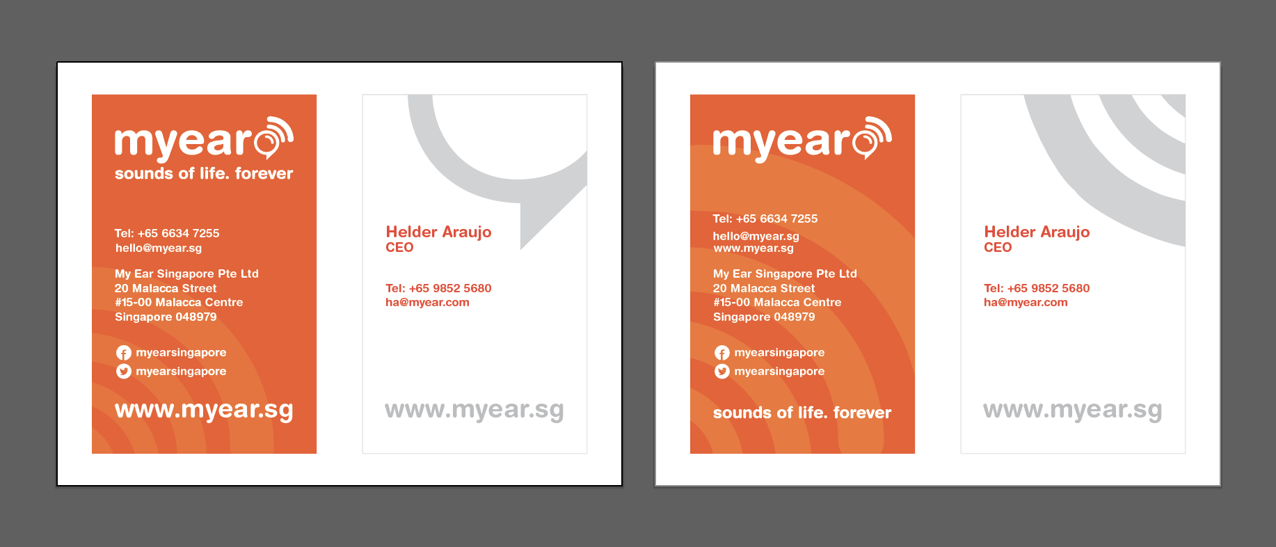
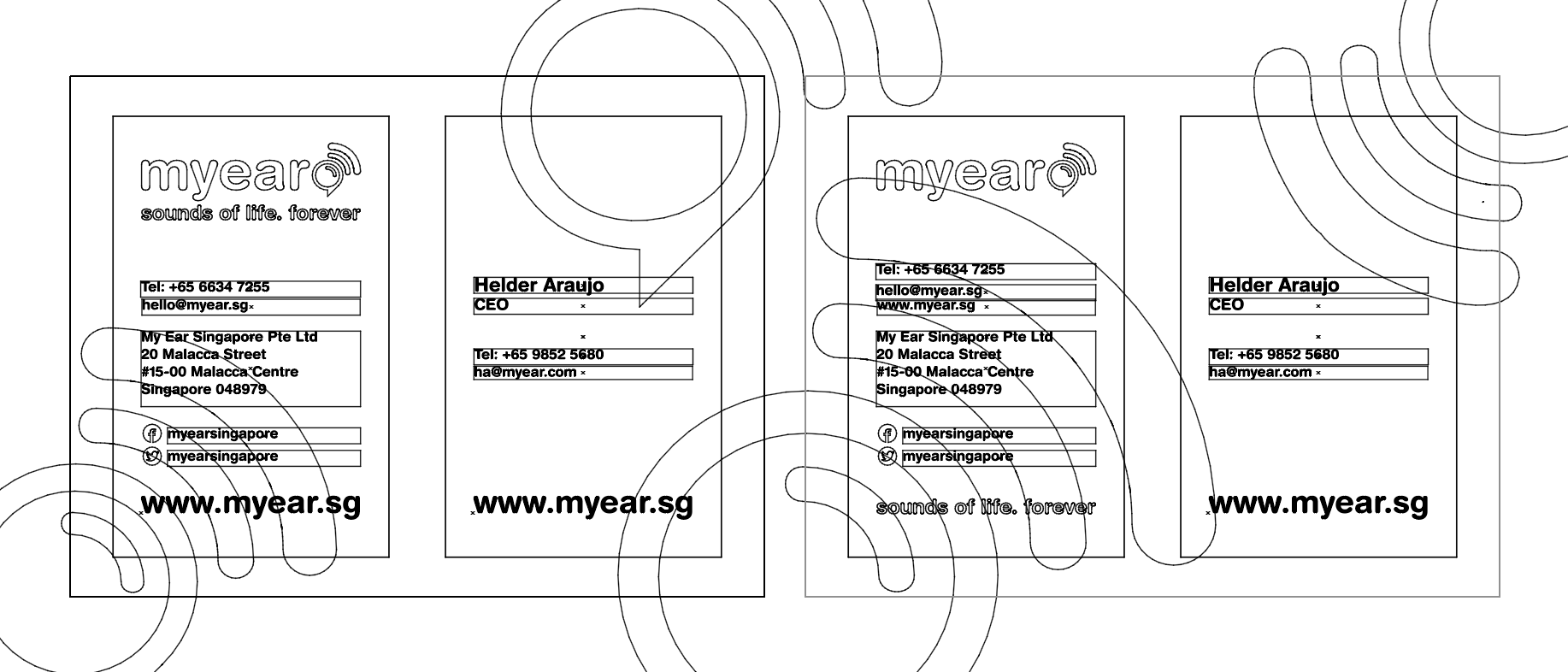
By giving two options to the client, he has chosen the following design:
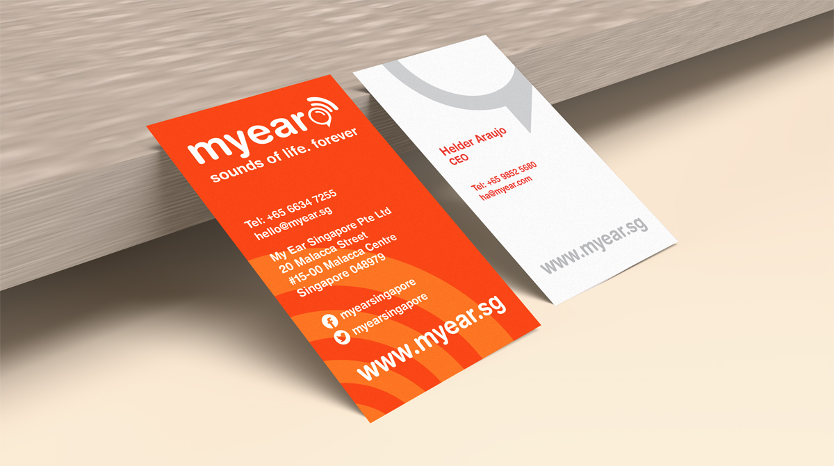
Outcome
A name card should include business/person's information as well as their brand identity. Besides that, It should be able to communiate with the consumer/customer/audience easily and deliver their business nature to the customer. The target audience must be considered when designing a name card.
Week 5
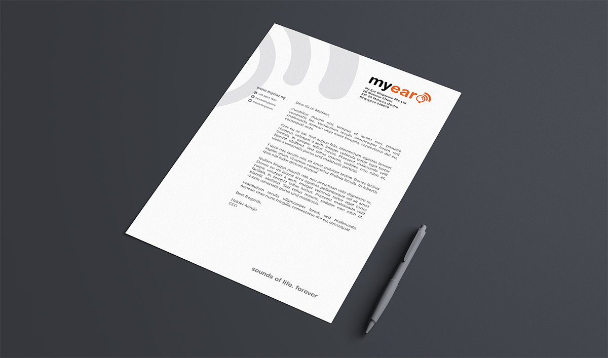
My Ear identity design jobs also include letterhead and A4 folder designs. According to client's brief, letterhead size is standard A4 and it can contain their three ID coulrs (white, black and orange), but preferably, the folder needs to use two colours (orange and white) similar to their name card (back).
Here are the things that need to be considered for a letterhead design:
- Brand ID
- Business name and address
- Contact information
- Company's website and social channels
- Gridlines/Folding lines
- Content styles (Font size, alignments etc.)
Two options were designed for this job:
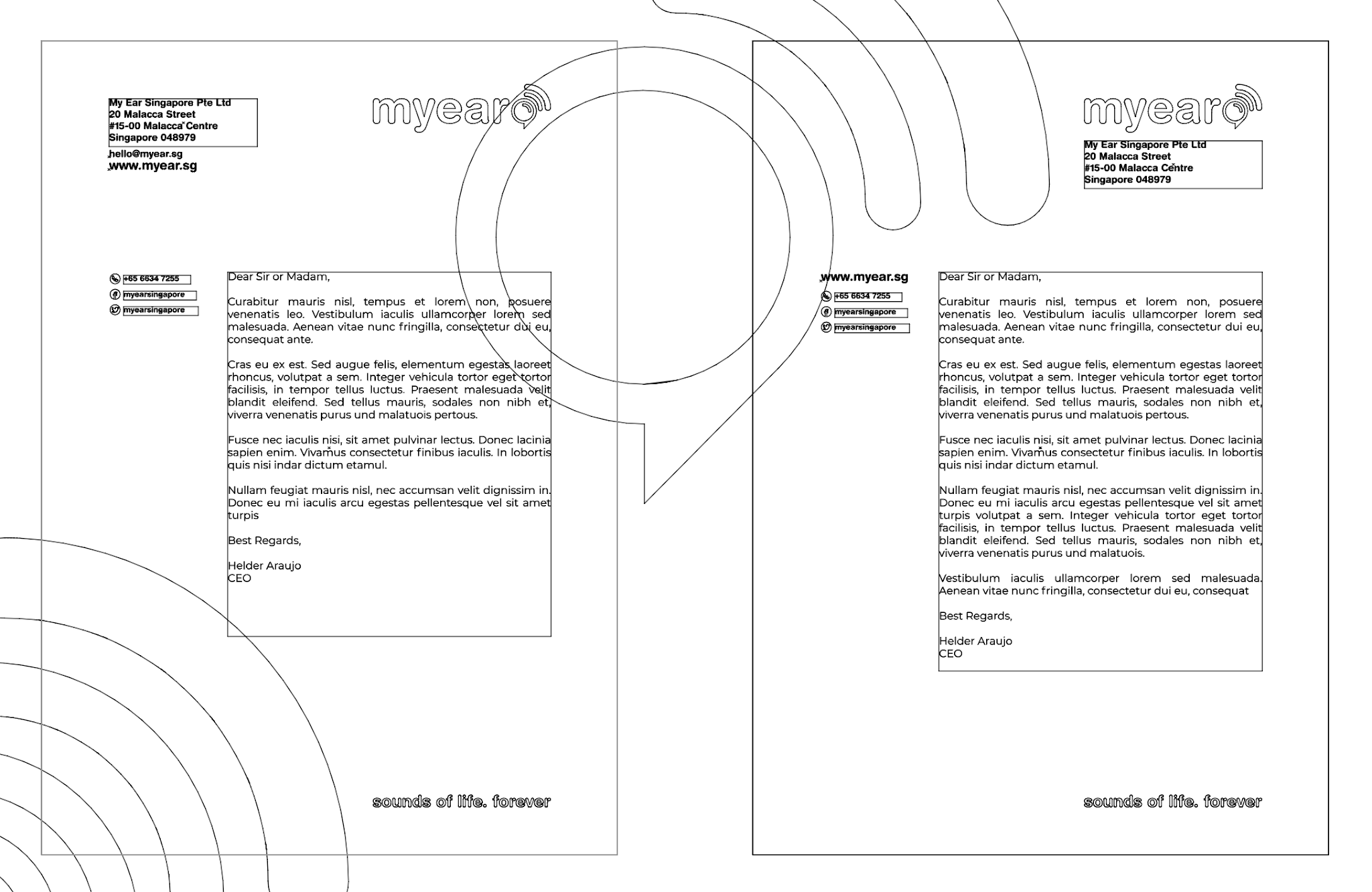

Here is the chosen design by client:
As for the A4 folder, the it needs to be using only two colours and following the standard size of 345 x 240 mm.
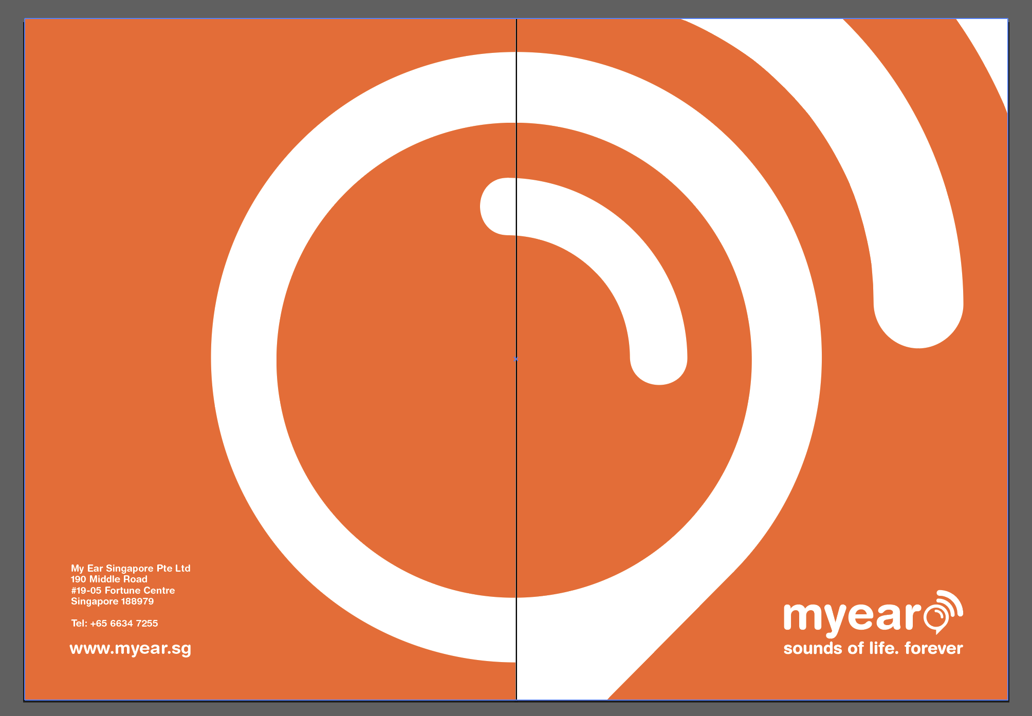
The outcome of the design:

Challenges
- As a designer I need to consider things such as color modes and layout guidelines for both print and screen designs. Sometimes you designs need to be compatible with the traditional platforms as well as the modern ones. So this should be considered beforehand and could be challenging.
- Clients/customers are not designers. They may not understand things about designs, so it could be challenging them to describe your logic/philosophy about your design concept.
- Working with clients in overseas could be sometime challenging as things could be misunderstood amongst your communication since you cannot have face to face meetings. Thank to digital technologies, voice and video calls can make your communication more clear but sometimes this could face barriers expecially when your client is busy.
Final Outcome
- I developed new skills for print design and especially when designing stationaries - and how to make them compatible with and convertable to other platforms such as for social media
- Experiencing design for a different target audience (Elderies)
- This job helped developing my networking and having more chances to get more works from overseas (Singapore)

Comments
Post a Comment