Work Placement [Week 2 to 5] - Brand Identity Design

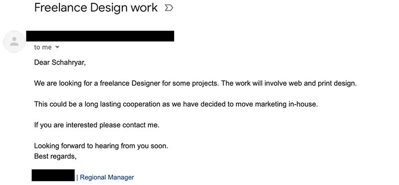
Week 2 As a freelance designer I have recevied a request from a hearing aid manufacturer in Singapore for rebraning and identity design. The company is called "My Ear" is producing hearing aid devices and selling their products in Singapore and New Zealand. Their target audience is people with hearing problems - mostly age range of 55+, but they want their logo to be simple and modern. Color Theme The color theme I chose for this brand is in a range of orange and yellowish. The reason for choosing such a color swatch is to represent enthusiasm, happines, success and encouragement - especially for old people. Ideas The idea for designing a logo for this brand is to make the logo representing the nature of their products which is hearinf aid and making your ear (hearing ability) stronger. To emphsize this concept, the logo should visualize the ear and the funtionality of the brand. So, the symbols of ear and waves should be used in the logo mark. Sk...


